# react-native-responsive-grid
**Repository Path**: mirrors_opencollective/react-native-responsive-grid
## Basic Information
- **Project Name**: react-native-responsive-grid
- **Description**: Bringing the Web's Responsive Design to React Native
- **Primary Language**: Unknown
- **License**: MIT
- **Default Branch**: master
- **Homepage**: None
- **GVP Project**: No
## Statistics
- **Stars**: 0
- **Forks**: 0
- **Created**: 2020-09-25
- **Last Updated**: 2026-05-24
## Categories & Tags
**Categories**: Uncategorized
**Tags**: None
## README
[](https://npmjs.org/package/react-native-responsive-grid)
# React Native Library for Responsive and Universal Apps
### Install
In your project folder, `yarn add react-native-responsive-grid`
*requires React Native 0.43.x or newer
## Background
Before React Native v0.42 we didn't have a performant, declarative way of specifying percentage-based dimensions. Then came React Native v0.42 which gave us that ability. Since then several open source contributors have made responsive grids that take advantage of this new capability. This "grid" takes one of the simplest and most well-thought-out ones, namely, `react-native-flexbox-grid` (by @rundmt), and modifies it heavily to produce a simple yet powerful layout model that we can use to implement responsive and adaptive behavior in our apps.
## Responsive Layout
This grid eschews Flexbox-based constraint-based grow/shrink sizing in favor of percentage-based sizing while at the same time relying other aspects of Flexbox's 1-dimensional constraint-based layout. The grid aims to deliver the predictability of the percentage-based model with the more sophisticated alignment capability of the Flexbox model.
_The grid construct is extended beyond its common form as a Rectilinear 2D Grid and generalized as cross-nestable Row and Column components that can be combined in an alternating pattern to build a tree of Views of any shape and depth. That is to say, a Row View (Row for short) may contain one or more Column Views (Column for short), each of which may contain one or more Rows, which in turn may contain one or more Columns, and so on. Both Rows and Columns can be styled using predictable, percentage-based width, height, padding and margins. Rows can be aligned vertically (along main axis) and horizontally (along cross axis) inside Columns, and Columns can be aligned horizontally (along main axis) and vertically (along cross axis) inside Rows. [Additionally, the multiple lines created by wrapped Row content may be aligned vertically relative to the parent Column.] And with this, we can build the entire UI component tree (or an individual component's subtree) using a consistent, repeatable and recursive pattern, one that has predictable and dynamic --not only static-- responsiveness and the ability to trigger specific adaptive behavior built into it._
_The tree nodes are represented by Rows and their children are represented by Columns. Tree leaves are Columns that have no Row as a child._
### A grid or a tree?
With this grid, we don't lose any aspect of the Flexbox based responsive grid. We simply gain a generalized and consistent way of building responsive UI component trees.
A grid is basically a tree where the rows are the children and the columns within each are the grand children. But a UI is constructed as a tree of arbitrary shape which corresponds to the UI's visual composition, so a normal rectilinear 2D grid is the simplest tree structure but for a layout farmework, which is what the responsive grid is, we want the ability to build UI View trees of any shape and complexity with predictable responsive behavior. That is what this grid gives us. It's a granular, responsive layout system, not just a design/formatting tool. We could certainly constructa high level rectilinear 2D grid with it, but that is just a specific use case.
(for more details see [Design Principles](https://github.com/idibidiart/react-native-responsive-grid/blob/master/DesignPrinciples.md))
## Examples
You may use this grid to build responsive 2D layouts that maintain their relative proportions, change their basic structure in a predictable way and dynamically decide what content to display, based on screen size, aspect ratio, and orientation.
## [Example 1: Universal, Responsive Pinterest Layout](https://www.youtube.com/watch?v=QyIRoKinyLU)
[](https://www.youtube.com/watch?v=QyIRoKinyLU)
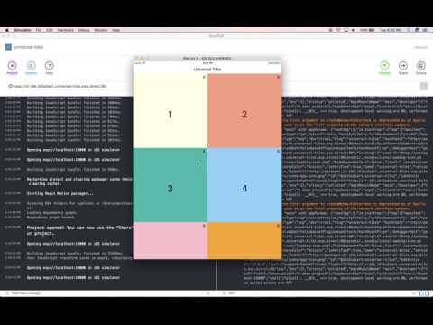
## [Example 2: Reponsive Tiles for Universal Apps](https://www.youtube.com/watch?v=OPUKz9wQ1Ks)
[](https://www.youtube.com/watch?v=OPUKz9wQ1Ks)
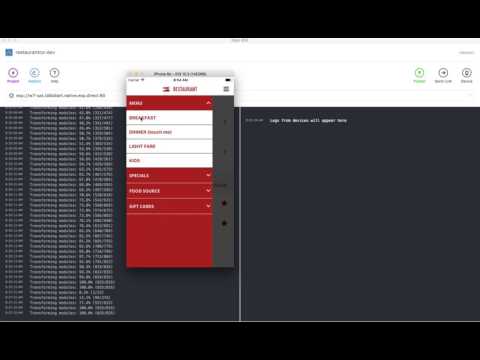
## [Example 3: Selecting an image with the right aspect ratio](https://www.youtube.com/watch?v=Nghqc5QFln8)
[](https://www.youtube.com/watch?v=Nghqc5QFln8)
## [Example 4: Responsive Break Points (Row Wrapping)](https://www.youtube.com/watch?v=GZ1uxWEVAuQ)
[](https://www.youtube.com/watch?v=GZ1uxWEVAuQ)
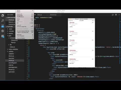
## [Example 5: FlatList + Row & Column Wrapping](https://www.youtube.com/watch?v=qLqxat3wX_8)
[](https://www.youtube.com/watch?v=qLqxat3wX_8)
The demos in the videos above show some of the possibilities, but this grid is capable of more complex responsive and adaptive behavior.
## Components
- Row: Flexbox View with flexDirection set to 'row' and less confusing names for flex styles.
- Col: Flexbox View with flexDirection set to 'column' and less confusing names for flex styles.
- Grid: an optional, stateful, top-level component (at root, above ScrollView, ListView, FlatList et al but below a Modal) that is not meant to be nested. The Grid uses the children-as-funnction pattern and passes its state to its childre which can be declared in its props, and which will have the latest screen and grid info after orientation changes. It also passes it's async render-causing setState method to its children.
IMPORTANT:
Response to orientation change in layout requires use of Grid component (many examples here.) Response to non-orientation change in layout requires flall back to Flexbox 'flex' contraint setting (e.g. to fill empty space after some node is unmounted, no JS involved (todo: provide an example.)
Below is an example:
```jsx
export const Home = () => (
{({state, setState}) => (
{/* possibly other JSX here */}
{layout(state)}
)}
)
```
## Methods
Row and Column have `.hide()` and `.show()` instance methods. The instance reference you get from a ref callback will have these methods. See Example #1 for usage.
## Instance Variables
These are provided mainly for unit tests, except for componentInstance.hidden and componentInstance.shown which can be used to tell the state of the component.
### Example 1
This examples showcases 2-dimensional Constraint-Based Layout using a custom layout in a few lines of code. Flexbox fails us here in that it does not support a 2-dimensional constraint layout. This is precisely why React Native needs native support for display:'grid' Until then you may use this grid with your own constraint-based layout. This example shows a simplified Pinterest-like layout. You may extend it to build a masonry effect using a box packing algorithm and Flexbox's 1-dimensional constraint-based elastic layout. One thing this grid is not designed to do is to implement transitions but it can be forked and extended to do that (would happy take a PR.)
[Source Code for Example 1](https://github.com/idibidiart/react-native-responsive-grid/blob/master/UniversalPinterestLayout.md)
### Example 2
This examples showcases the grid's 1-dimensional Constraint-Based Layout using Flexbox wrapping behavior.
The problem it solves is how to make a tiled screen layout that looks consistent across all screen sizes and aspect ratios, It involves the following:
1. How to size tiles such that they change size relative to the size of the screen *as well as* retain their shape (width/height aspect ratio)
2. How do we hide/show tiles on demand and fill the void left by hidden tiles.
The goal is how to do the above in an elegant and declarative way that allows the average user to work without all the tedious implementation details of doing it in row Flexbox and JS.
[Source Code for Example 2](https://github.com/idibidiart/react-native-responsive-grid/blob/master/UniversalTiles.md)
### Example 3
In this demo, the grid picks the image with the **closest aspect ratio** to the device aspect ratio, dynamically, taking into account the current device orientation. The images themselves must be sized and cropped by the designer so that they match the common device aspect ratios (see below) while also showing the part of the image that the designer intends to show for each aspect ratio. Since there could be many aspect ratios that correspond to different devices we should have multiple such images (and, optionally, their rotated versions.)
The following table maps some common device aspect ratios to the ratio of width/height of devices known to this developer, for both landscape and portrait device orientations. The physical device aspect ratio does not change with device rotation (i.e. a device with 16:9 aspect ratio does not become one with a 9:16 aspect ratio when it's rotated, although it does mathematically), but since the width and height get flipped when changing orientation from portrait to lanscape and vice versa, we need to have two images per each physical device aspect ratio, one for portrait mode and the other for landscape. However, if our app only supports portrait or landscape mode then we only need to have the one corresponding to that orientation.
| Aspect Ratio | Width | Height | Width/Height Ratio (landscape) | Devices
| :---: | :---: | :---: | :---: | :---: |
| '16:9' | 568 | 320 | 1.77 | iPhone 5
| '16:9' | 667 | 375 | 1.77 | iPhone 6 & 7
| '16:9' | 736 | 414 | 1.77 | iPhone 6 Plus & 7 Plus
| '16:10' | ? | ? | 1.6 | ?
| '3:2' | 480 | 320 | 1.5 | iPhone 4
| '4:3' | 1024 | 768 | 1.33 | iPad Mini, iPad Air and small iPad Pro
| '4:3' | 1366 | 1024 | 1.33 | Large iPad Pro
| '1:1' | 1 | ? | ? | ?
| Aspect Ratio | Width | Height | Width/Height Ratio (portrait) | Devices
| :---: | :---: | :---: | :---: | :---: |
| '16:9' | 320 | 568 | 0.56 | iPhone 5
| '16:9' | 375 | 667 | 0.56 | iPhone 6 & 7
| '16:9' | 414 | 736 | 0.56 | iPhone 6 Plus & 7 Plus
| '16:10' | ? | ? | 0.625| ?
| '3:2' | 320 | 480 | 0.66 | iPhone 4
| '4:3' | 768 | 1024 | 0.75 | iPad Mini, iPad Air and small iPad Pro
| '4:3' | 1024 | 1366 | 0.75 | Large iPad Pro
| '1:1' | 1 | ? | ? | ?
```jsx
{({state, setState}) => (
{/* possibly other JSX here */}
)
}
```
### Example 4
A more basic example of he grid's 1-Dimensional Constraint-Based Layout using Flexbox.
In the second demo, the grid folds columns in rows based on the screen-device-depebdent `xxSize` prop provided on the column (which can be percentage based, e.g. smSize, or point based, e.g. smSizePoints. This means that different break points can be supplied for the different screen sizes in both absolute and relative terms. This example demonstrates how to get Row content (e.g. child Columns) to wrap at certain break points (which can be supplied per screen width)
The following are the preset screen widths at which break points maybe specified:
- sm: <= 480px
- md: > 480 and < 1024
- lg: >= 1024 and < 1366
- xl: >= 1366
```jsx
{({state, setState}) => (
{/* possibly other JSX here */}
March 9, 2017
TAKEOUT ORDER
Double Cheese Burger
)
}
```
### Example 5
FlatList is a virtualized replacement for React Native's old ListView component. Using FlatList as a container is supported by this grid. This example also demonstrate wrapping Column content based on screen size. See ('size' prop under the [Props](https://github.com/idibidiart/react-native-responsive-grid#props) section.) It also demonstrates who to wrap Row content (e.g. child columns) based on screen size (also see [Example 2](https://github.com/idibidiart/react-native-responsive-grid#example-2) for more details)
```jsx
import React, { Component } from 'react';
import {
FlatList,
Text,
ScrollView
} from 'react-native';
import { Row, Column as Col, Grid} from 'react-native-responsive-grid'
import { MaterialIcons } from '@expo/vector-icons';
import faker from 'faker';
let j = 0
const randomUsers = (count = 10) => {
const arr = [];
for (let i = 0; i < count; i++) {
arr.push({
key: faker.random.uuid(),
date: faker.date.weekday(),
name: faker.name.firstName(),
job: faker.name.jobTitle(),
index: j++
})
}
return arr
}
export default class Home extends Component {
state = {
refreshing: false,
data: randomUsers(10),
};
onEndReached = () => {
const data = [
...this.state.data,
...randomUsers(10),
]
this.setState(state => ({
data
}));
};
onRefresh = () => {
this.setState({
data: randomUsers(10),
});
}
render() {
return (
{({state, setState}) => (
{/* possibly other JSX here */}
{
return (
{String(item.date)}
{item.job}
{item.name}
{item.index}
)
}}
/>)
}
}
}
```
## Props
All props are case sensitive.
`aspectRatio` (see [Example 2](https://github.com/idibidiart/react-native-responsive-grid#example-2))
`layoutEvent` (see [Examples 4](https://github.com/idibidiart/react-native-responsive-grid#example-4))
`size` may be supplied as prop to Column (width) or Row (height). This number defines the width of the column or height of a row as a percentage of its parent view's computed or explicit width or height, respectively.
`smSize`, `mdSize`, `lgSize` and `xlSize` are device-dependent size values that are applied to columns. In addition to their utility in deciding the size of content based on screen size, they may are also used for defining column wrapping behavior based on screen size. For example, column content will wrap if column size is made smaller at smaller screen sizes.
`sizePoints` may be supplied as prop to Column (width) or Row (height). This number defines the width of the column or height of a row as an asolute value in points.
`smSizePoints`, `mdSizePoints`, `lgSizePoints`, and `xlSizePoints` are like their percentage-based equivalents but use absolute value.
`offset` may be applied to Column. This number defines the marginLeft (or marginRight in csase of RTL mode) for the column as a percentage of its parent view's computed or explicitly set width. Offset values can also be negative. Default is 0.
`smOffset`, `mdOffset`, `lgOffset` and `xlOffset` are device-dependent offset values that are applied to columns.
`offsetPoints`, `mdOffsetPoints`, `lgOffsetPoints`, and `xlOffsetPoints` are like their percentage-based equivalents but use absolute value in points (Number) instead of relative value in percent (String.)
_Using offset values in RTL mode moves things from right to left. Using them in normal LTR mode moves things from left to right. It's pretty normal to expect that. If you're working in both directions, this makes offsets more useful than using marginLeft or marginRight directly._
_Specifying an offset value in normal LTR mode means marginLeft (if specified in style prop) will be overwritten by offset value. However, marginRight (if specified in style prop) will not be overwritten by the offset value. Specifying offset value in RTL mode means marginRight (if specified in style prop) will be overwritten by offset value. However, marginLeft (if specified in style prop) will not be overwritten by offset value._
`smHidden`, `mdHidden`, `lgHidden` and `xlHidden` - may be applied to Column. This tells the grid to hide certain columns based on the current width of the screen.
`vAlign` may be supplied as prop to Column to vertically align the elements and/or rows within it. Possible values are: `middle` | `center`, `top`, `bottom`, `space` and `distribute`. Default is top.
`vAlign` may also be supplied as prop to Row to align the columns within it in the vertical direction. Possible values are: `top`, `middle` | `center`, `bottom`, `baseline` and `stretch`. Default is top.
`hAlign` may be supplied as prop to Row to align the columns within it in the horizontal direction. Possible values are: `center` | `middle`, `left`, `right`, `space` and `distribute`. Default is left.
`hAlign` may also be supplied as prop to Column to align its rows and/or elements within it in the horizontal direction. Possible values are: `center` | `middle`, `left`, `right`, and `stretch`. Default is left.
`rtl` may be supplied as prop to Row to both reverse the order of columns (or elements) inside a row as well as to set hAlign to 'right.' This is useful for right-to-left layouts.
`fullHeight` may be supplied as prop to Row as a convenience to enable vAlign to work on child Column(s) -- fullWidth on Row is not desired since it would interfere with Column's offset prop.
`fullWidth` may be supplied as prop to Column as a convenience to enable hAlign to work on child Row(s) -- fullHeight on Column is not desired since it would interfere with Row's size prop.
_Note, if row (or column) is a child of ScrollView you need to set the height (or width) explicitly, and if you wish to set it explicitly relative to container see Example # 1 which uses layoutEvent to get container size at runtime._
`alignLines` may be supplied as prop to Row to vertically align the wrapped lines within the Row (not to be confused with the items that are inside each line.) Possible values are: top, middle, bottom, space, distribute, stretch. (See section on Aligning Wrapped Lines within Rows)
`alignSelf` maybe supplied as prop to Row to override the hAlign prop of the parent Column for that Row.
Possible values are: `auto`, `left`, `right`, `center` | `middle`, `stretch`
`alignSelf` maybe supplied as prop to Column to override the vAlign prop of the parent Row for that Column.
Possible values are: `auto`, `top`, `bottom`, `middle` | `center`, `stretch`, `baseline`
`noWrap` may be supplied as prop to Row prevent child elements from wrapping.
The screen-size-specific _size_, _offset_ and _hidden_ props refer to the effective screen width, which changes with orientation.
The following are the screen width thresholds for these props:
- sm: <= 480px
- md: > 480 and < 1024
- lg: >= 1024 and < 1366
- xl: >= 1366
### Nesting
If you're nesting a column inside a row which is inside another column that is inside another row as below:
```jsx
{({state, setState}) => (
{/* possibly other JSX here */}
This column is 25% of the outer view's width (or 25% of the screen width if
the top level Row has no parent)
)}
)
```
The nested column's size will be the column size value (size, sm, md, lg, xl) as a percentage of the width of the preceding column in the hierarchy .
This nested percentages model applies to offsets, too.
### RTL Support
This is intended for right-to-left (RTL) layouts and apps that have their text in any of the following languages:
- Arabic
- Aramaic
- Azeri
- Dhivehi/Maldivian
- Hebrew
- Kurdish (Sorani)
- Persian/Farsi
- Urdu
Notice the reversed order of the Text relative to the physical order in the markup. Also notice that columns are justified as flex-end within the row and their content is rightAligned (except for the second column which is explicitly leftAligned to mimic the rightAligned behavior in normal ltr layout)
 ### Normal LTR Markup
```jsx
{({state, setState}) => (
{/* possibly other JSX here */}
### Normal LTR Markup
```jsx
{({state, setState}) => (
{/* possibly other JSX here */}
PREVIOUS ORDERS
SEE ALL
)}
)
```
### RTL Markup
Notice the offset values work in RTL direction now. The addition of .7 offset is to mimic the fact that the left margin in the LTR layout is smaller than the right margin in that layout, whereas it's the opposite in the RTL direction. So the .7 offset is used in RTL layout instead of the 1 offset, so alignment is identical.
```jsx
{({state, setState}) => (
{/* possibly other JSX here */}
PREVIOUS ORDERS
SEE ALL
)}
)
```
### Utils
You may import ScreenInfo from grid and invoke inside of render() of your component to get current screen diemsnions and orientation.
### Predictable, Dynamic Layout Behavior
Being able to readt to layout changes, including changes due to device rotation (for apps that allow it), is a key aspect of responsive design. This grid is designed to enable dynamic response to layout changes (see the demos at the start of this Readme)
Columns and Rows have `position: 'relative'` enforced by design to keep them within the layout flow. Each can be moved about within their parent Row and Column, respectively, using top and bottom margins and/or offsets. Columns can be made to overlap horizontally within the row using a negative offset in LTR or RTL directions (see RTL support.) Rows can be made to overlap vertically within a column using a negative top and bottom margins. The intent is to allow the free positioning of rows and columns without taking them out of the layout flow. This is required to have a predictable response to layout change.
The Grid component is a stateful top level component (at root, above ScrollView, ListView, FlatList et al but below a Modal) and does not nest (will warn and nullify nested instances.) It responds to orientation changes and uses the children-as-funnction pattern to pass its state, including its dimensions and any user-defined state, along with screen dimensions, to its children. The user may define Grid state in its props. The Grid also passes it's async render-causing setState method to its children.
## More Examples
```jsx
import {Column as Col, Row} from 'react-native-responsive-grid';
{({state, setState}) => (
{/* possibly other JSX here */}
First Column
)}
```
In the example abovw, on a phone in portrait mode, the Column would take up 50% of the row's computed width. On a phone in landscape nmode or a normal tablet the Column would take up 33.333% of the row's width. On a big tablet the Column would take up 25% of the row's width.
```jsx
import {Column as Col, Row} from 'react-native-responsive-grid';
{({state, setState}) => (
{/* possibly other JSX here */}
test
)}
```
In the example above, the text "test" will move further to the right with larger screen sizes.
```jsx
import {Column as Col, Row} from 'react-native-responsive-grid';
{({state, setState}) => (
{/* possibly other JSX here */}
Column displayed when width is <= 480
Column displayed when width is > 480
)}
```
In the example above, the column and all of it's children will be hidden on small screens like phones, but it will appear on bigger screens like tablets. The size-prefixed 'hidden' props may be applied to columns. Hidden props are all booleans. They default to false.
## More Examples
- [Responsive Layout](https://github.com/idibidiart/react-native-responsive-grid/blob/master/EvenMoreExamples.md#responsive-layout)
- [Custom Components](https://github.com/idibidiart/react-native-responsive-grid/blob/master/EvenMoreExamples.md#custom-components)
- [Wrapped Alignment](https://github.com/idibidiart/react-native-responsive-grid/blob/master/EvenMoreExamples.md#wrapped-alignment)
# Gridism
## _When I first made a grid I happened to be thinking of the innocence of trees and then this grid came into my mind and I thought it represented innocence, and I still do, and so I painted it and then I was satisfied. I thought, this is my vision._ --[Agnes Martin](https://www.guggenheim.org/arts-curriculum/topic/grids)