# nativescript-datetimepicker
**Repository Path**: mirrors_NativeScript/nativescript-datetimepicker
## Basic Information
- **Project Name**: nativescript-datetimepicker
- **Description**: Plugin with date and time picking fields
- **Primary Language**: Unknown
- **License**: Apache-2.0
- **Default Branch**: master
- **Homepage**: None
- **GVP Project**: No
## Statistics
- **Stars**: 0
- **Forks**: 0
- **Created**: 2023-02-13
- **Last Updated**: 2026-03-30
## Categories & Tags
**Categories**: Uncategorized
**Tags**: None
## README
# ALL NativeScript 7 Issues should be posted here: https://github.com/NativeScript/plugins/
## NativeScript 7
* Use `@nativescript/datetimepicker`: `~2.0.0`
* [Source managed here](https://github.com/NativeScript/plugins)
## If using 6 and below, see the following:
# NativeScript DateTimePicker
[](https://www.npmjs.com/package/nativescript-datetimepicker)
[](https://www.npmjs.com/package/nativescript-datetimepicker)
[](https://travis-ci.org/NativeScript/nativescript-datetimepicker)
A [NativeScript](https://www.nativescript.org) plugin that provides ui elements for picking date and time. The plugin provides UI elements for picking date and time - `DatePickerField`, `TimePickerField` and `DateTimePickerFields` - they are all NativeScript Views that show selected date and/or time and allow picking another after being tapped. There is also a `DateTimePicker` class which provides static methods `pickDate` and `pickTime` that can be called to show the same dialog picker as the fields.
- [Installation](#installation)
- [Configuration](#configuration)
- [Usage](#usage)
- [Features](#features)
- [DatePickerField and TimePickerField](#datepickerfield-and-timepickerfield)
- [DateTimePickerFields](#datetimepickerfields)
- [DateTimePicker](#datetimepicker)
- [API](#api)
- [Contribute](#contribute)
- [Get Help](#get-help)
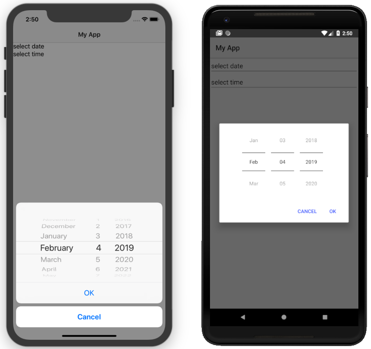
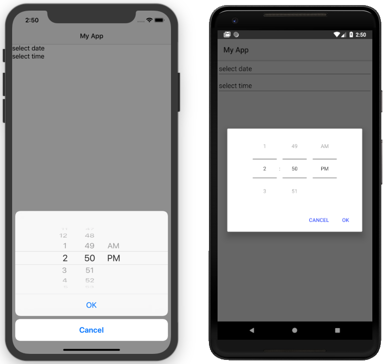
## Screenshots
 ## Installation
```
tns plugin add nativescript-datetimepicker
```
## Configuration
No additional configuration required!
## Usage
To use one of the UI elements `DatePickerField`, `TimePickerField` or `DateTimePickerFields` in markup you need to:
- If you are developing a NativeScript Core app, you need to register the plugin namespace in the xml:
```xml
...
```
- If you are developing a NativeScript Angular app, you need to import the plugin module in the module of your component:
```ts
import { NativeScriptDateTimePickerModule } from "nativescript-datetimepicker/angular";
...
@NgModule({
imports: [
NativeScriptCommonModule,
NativeScriptDateTimePickerModule,
...
],
...
```
Then you will be able to declare the fields in the html of your component:
```html
```
- If you are developing a NativeScript Vue app, you need to install the plugin in you app.js file:
```js
import Vue from "nativescript-vue";
import DateTimePicker from "nativescript-datetimepicker/vue";
Vue.use(DateTimePicker);
```
Then you will be able to decrare the fields in the template of your component:
```html
```
## Features
### DatePickerField and TimePickerField
The `DatePickerField` and the `TimePickerField` are NativeScript Views that extend `TextField`, when tapped, they open a picker dialog that allows date/time selection.
- Getting/Setting Date and Time
The `DatePickerField` has a `date` property and the `TimePickerField` has a `time` property which can be used to get their current value. You can also set their value through markup. `DatePickerField`'s `date` property will just pass the string you provide as a parameter to the [Date constructor](https://developer.mozilla.org/en-US/docs/Web/JavaScript/Reference/Global_Objects/Date), while the `TimePickerField`'s `time` property can parse values in [ISO 8601](https://en.wikipedia.org/wiki/ISO_8601#Times) format. Here's an example in the [demo](https://github.com/NativeScript/nativescript-datetimepicker/blob/master/demo/app/home/home-page.xml#L19), [demo-angular](https://github.com/NativeScript/nativescript-datetimepicker/blob/master/demo-angular/src/app/home/home.component.html#L14) and [demo-vue](https://github.com/NativeScript/nativescript-datetimepicker/blob/master/demo-vue/app/components/Home.vue#L16) applications.
- TextField Features
Both `DatePickerField` and `TimePickerField` extend `TextField`, so each `TextField` feature like the `hint` property, is also available for these fields. Here's an example in the [demo](https://github.com/NativeScript/nativescript-datetimepicker/blob/master/demo/app/home/home-page.xml#L15), [demo-angular](https://github.com/NativeScript/nativescript-datetimepicker/blob/master/demo-angular/src/app/home/home.component.html#L10) and [demo-vue](https://github.com/NativeScript/nativescript-datetimepicker/blob/master/demo-vue/app/components/Home.vue#L12) applications.
- Picker Texts
When one of the fields is tapped, a popup is opened. The popup has an OK and Cancel buttons and an optional title. Their text values are controlled respectively by the properties `pickerOkText`, `pickerCancelText` and `pickerTitle`. By default, the texts of the buttons OK and Cancel are `OK` and `Cancel` on iOS, and a localized version of OK and Cancel, dependent on the current setting of the device on Android. The `pickerTitle` is undefined. Changing these values is demonstrated in the [demo](https://github.com/NativeScript/nativescript-datetimepicker/blob/master/demo/app/home/home-page.xml#L27), [demo-angular](https://github.com/NativeScript/nativescript-datetimepicker/blob/master/demo-angular/src/app/home/home.component.html#L22) and [demo-vue](https://github.com/NativeScript/nativescript-datetimepicker/blob/master/demo-vue/app/components/Home.vue#L24) applications.
- Localization
By default the `DatePickerField` and the `TimePickerField` will use the current language and region settings of the device to determine their locale. The locale is used for the names of the months, for the date picking spinners order (the month selector can be either the first or the second spinner) and whether the time is in 12h or 24h format. Both fields have a `locale` property that accepts values in the format specified [here](https://developer.apple.com/library/archive/documentation/MacOSX/Conceptual/BPInternational/LanguageandLocaleIDs/LanguageandLocaleIDs.html) as Locale ID. For example, using `en_GB` will result in month names spinner in the middle and values between 0 and 23 for the hours, while using `en_US` will result in month names spinner on the left and values between 1 and 12 for the hours. Changing the locale is demonstrated in the [demo](https://github.com/NativeScript/nativescript-datetimepicker/blob/master/demo/app/home/home-page.xml#L37), [demo-angular](https://github.com/NativeScript/nativescript-datetimepicker/blob/master/demo-angular/src/app/home/home.component.html#L32) and [demo-vue](https://github.com/NativeScript/nativescript-datetimepicker/blob/master/demo-vue/app/components/Home.vue#L34) applications.
- Formats
Aside from the default formats that are dependent on the value of the `locale` property, you can add your custom format that can include ordering of the date/time values and also custom text. The property controlling the format in the `DatePickerField` is called `dateFormat` and the property controlling the format in the `TimePickerField` is `timeFormat`. Changing the default formats is demonstrated in the [demo](https://github.com/NativeScript/nativescript-datetimepicker/blob/master/demo/app/home/home-page.xml#L42), [demo-angular](https://github.com/NativeScript/nativescript-datetimepicker/blob/master/demo-angular/src/app/home/home.component.html#L37) and [demo-vue](https://github.com/NativeScript/nativescript-datetimepicker/blob/master/demo-vue/app/components/Home.vue#L39) applications.
- Minimum and Maximum Dates
The `DatePickerField` has a `minDate` and `maxDate` properties that allow limiting the values that can be selected. This is demonstrated in the [demo](https://github.com/NativeScript/nativescript-datetimepicker/blob/master/demo/app/home/home-page.xml#L23), [demo-angular](https://github.com/NativeScript/nativescript-datetimepicker/blob/master/demo-angular/src/app/home/home.component.html#L18) and [demo-vue](https://github.com/NativeScript/nativescript-datetimepicker/blob/master/demo-vue/app/components/Home.vue#L20) applications.
- Using 12 h and 24 h Time Formats
The `TimePickerField` will determine whether to use 12 or 24 hour format (for formatting of the selected time in the field and for the values of the hour spinner) based on the selected region in the settings of the iOS device and based on the Use 24-Hour Format settings of the Android device. To change the default setting on Android, you need to use the `timeFormat` property and to change the setting on iOS, you need to use the `locale` property. Here's an example in the [demo](https://github.com/NativeScript/nativescript-datetimepicker/blob/master/demo/app/home/home-page.xml#L66), [demo-angular](https://github.com/NativeScript/nativescript-datetimepicker/blob/master/demo-angular/src/app/home/home.component.html#L61) and [demo-vue](https://github.com/NativeScript/nativescript-datetimepicker/blob/master/demo-vue/app/components/Home.vue#L63) applications.
- CSS
You can use css to style the `DatePickerField` and the `TimePickerField`. The field itself can be styled just as every other `TextField`, additionally the picker supports changing of its colors through predefined css classes: `date-time-picker` (picker background and title text color), `date-time-picker-spinners` (background and text color of the date/time selecting spinners), `date-time-picker-buttons` (background and text color of the OK/Cancel buttons), `date-time-picker-button-ok` and `date-time-picker-button-cancel` (to provide a separate style for each button). Please note that the iOS native implementation has limited capabilities for the buttons background colors. When a button is marked as a Cancel button, its background is always white and can't be changed. If you really need a cancel button with another color, you can pass a background color through the designated cancel button class, however this will change the picker layout and place the cancel button along with the OK button and they will both have the same background color.
## Installation
```
tns plugin add nativescript-datetimepicker
```
## Configuration
No additional configuration required!
## Usage
To use one of the UI elements `DatePickerField`, `TimePickerField` or `DateTimePickerFields` in markup you need to:
- If you are developing a NativeScript Core app, you need to register the plugin namespace in the xml:
```xml
...
```
- If you are developing a NativeScript Angular app, you need to import the plugin module in the module of your component:
```ts
import { NativeScriptDateTimePickerModule } from "nativescript-datetimepicker/angular";
...
@NgModule({
imports: [
NativeScriptCommonModule,
NativeScriptDateTimePickerModule,
...
],
...
```
Then you will be able to declare the fields in the html of your component:
```html
```
- If you are developing a NativeScript Vue app, you need to install the plugin in you app.js file:
```js
import Vue from "nativescript-vue";
import DateTimePicker from "nativescript-datetimepicker/vue";
Vue.use(DateTimePicker);
```
Then you will be able to decrare the fields in the template of your component:
```html
```
## Features
### DatePickerField and TimePickerField
The `DatePickerField` and the `TimePickerField` are NativeScript Views that extend `TextField`, when tapped, they open a picker dialog that allows date/time selection.
- Getting/Setting Date and Time
The `DatePickerField` has a `date` property and the `TimePickerField` has a `time` property which can be used to get their current value. You can also set their value through markup. `DatePickerField`'s `date` property will just pass the string you provide as a parameter to the [Date constructor](https://developer.mozilla.org/en-US/docs/Web/JavaScript/Reference/Global_Objects/Date), while the `TimePickerField`'s `time` property can parse values in [ISO 8601](https://en.wikipedia.org/wiki/ISO_8601#Times) format. Here's an example in the [demo](https://github.com/NativeScript/nativescript-datetimepicker/blob/master/demo/app/home/home-page.xml#L19), [demo-angular](https://github.com/NativeScript/nativescript-datetimepicker/blob/master/demo-angular/src/app/home/home.component.html#L14) and [demo-vue](https://github.com/NativeScript/nativescript-datetimepicker/blob/master/demo-vue/app/components/Home.vue#L16) applications.
- TextField Features
Both `DatePickerField` and `TimePickerField` extend `TextField`, so each `TextField` feature like the `hint` property, is also available for these fields. Here's an example in the [demo](https://github.com/NativeScript/nativescript-datetimepicker/blob/master/demo/app/home/home-page.xml#L15), [demo-angular](https://github.com/NativeScript/nativescript-datetimepicker/blob/master/demo-angular/src/app/home/home.component.html#L10) and [demo-vue](https://github.com/NativeScript/nativescript-datetimepicker/blob/master/demo-vue/app/components/Home.vue#L12) applications.
- Picker Texts
When one of the fields is tapped, a popup is opened. The popup has an OK and Cancel buttons and an optional title. Their text values are controlled respectively by the properties `pickerOkText`, `pickerCancelText` and `pickerTitle`. By default, the texts of the buttons OK and Cancel are `OK` and `Cancel` on iOS, and a localized version of OK and Cancel, dependent on the current setting of the device on Android. The `pickerTitle` is undefined. Changing these values is demonstrated in the [demo](https://github.com/NativeScript/nativescript-datetimepicker/blob/master/demo/app/home/home-page.xml#L27), [demo-angular](https://github.com/NativeScript/nativescript-datetimepicker/blob/master/demo-angular/src/app/home/home.component.html#L22) and [demo-vue](https://github.com/NativeScript/nativescript-datetimepicker/blob/master/demo-vue/app/components/Home.vue#L24) applications.
- Localization
By default the `DatePickerField` and the `TimePickerField` will use the current language and region settings of the device to determine their locale. The locale is used for the names of the months, for the date picking spinners order (the month selector can be either the first or the second spinner) and whether the time is in 12h or 24h format. Both fields have a `locale` property that accepts values in the format specified [here](https://developer.apple.com/library/archive/documentation/MacOSX/Conceptual/BPInternational/LanguageandLocaleIDs/LanguageandLocaleIDs.html) as Locale ID. For example, using `en_GB` will result in month names spinner in the middle and values between 0 and 23 for the hours, while using `en_US` will result in month names spinner on the left and values between 1 and 12 for the hours. Changing the locale is demonstrated in the [demo](https://github.com/NativeScript/nativescript-datetimepicker/blob/master/demo/app/home/home-page.xml#L37), [demo-angular](https://github.com/NativeScript/nativescript-datetimepicker/blob/master/demo-angular/src/app/home/home.component.html#L32) and [demo-vue](https://github.com/NativeScript/nativescript-datetimepicker/blob/master/demo-vue/app/components/Home.vue#L34) applications.
- Formats
Aside from the default formats that are dependent on the value of the `locale` property, you can add your custom format that can include ordering of the date/time values and also custom text. The property controlling the format in the `DatePickerField` is called `dateFormat` and the property controlling the format in the `TimePickerField` is `timeFormat`. Changing the default formats is demonstrated in the [demo](https://github.com/NativeScript/nativescript-datetimepicker/blob/master/demo/app/home/home-page.xml#L42), [demo-angular](https://github.com/NativeScript/nativescript-datetimepicker/blob/master/demo-angular/src/app/home/home.component.html#L37) and [demo-vue](https://github.com/NativeScript/nativescript-datetimepicker/blob/master/demo-vue/app/components/Home.vue#L39) applications.
- Minimum and Maximum Dates
The `DatePickerField` has a `minDate` and `maxDate` properties that allow limiting the values that can be selected. This is demonstrated in the [demo](https://github.com/NativeScript/nativescript-datetimepicker/blob/master/demo/app/home/home-page.xml#L23), [demo-angular](https://github.com/NativeScript/nativescript-datetimepicker/blob/master/demo-angular/src/app/home/home.component.html#L18) and [demo-vue](https://github.com/NativeScript/nativescript-datetimepicker/blob/master/demo-vue/app/components/Home.vue#L20) applications.
- Using 12 h and 24 h Time Formats
The `TimePickerField` will determine whether to use 12 or 24 hour format (for formatting of the selected time in the field and for the values of the hour spinner) based on the selected region in the settings of the iOS device and based on the Use 24-Hour Format settings of the Android device. To change the default setting on Android, you need to use the `timeFormat` property and to change the setting on iOS, you need to use the `locale` property. Here's an example in the [demo](https://github.com/NativeScript/nativescript-datetimepicker/blob/master/demo/app/home/home-page.xml#L66), [demo-angular](https://github.com/NativeScript/nativescript-datetimepicker/blob/master/demo-angular/src/app/home/home.component.html#L61) and [demo-vue](https://github.com/NativeScript/nativescript-datetimepicker/blob/master/demo-vue/app/components/Home.vue#L63) applications.
- CSS
You can use css to style the `DatePickerField` and the `TimePickerField`. The field itself can be styled just as every other `TextField`, additionally the picker supports changing of its colors through predefined css classes: `date-time-picker` (picker background and title text color), `date-time-picker-spinners` (background and text color of the date/time selecting spinners), `date-time-picker-buttons` (background and text color of the OK/Cancel buttons), `date-time-picker-button-ok` and `date-time-picker-button-cancel` (to provide a separate style for each button). Please note that the iOS native implementation has limited capabilities for the buttons background colors. When a button is marked as a Cancel button, its background is always white and can't be changed. If you really need a cancel button with another color, you can pass a background color through the designated cancel button class, however this will change the picker layout and place the cancel button along with the OK button and they will both have the same background color.
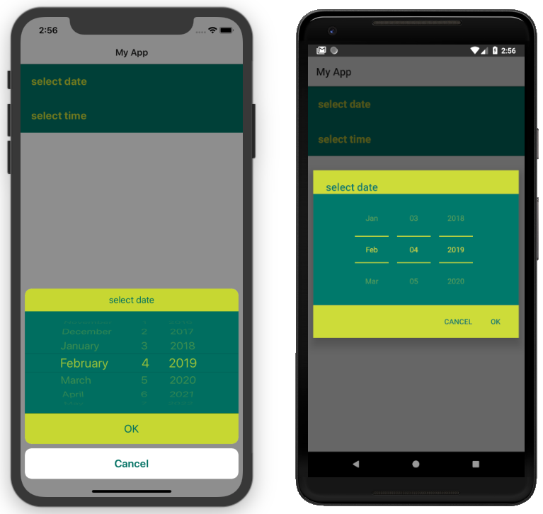 Here's the css used to achieve the above result, as used in the [demo](https://github.com/NativeScript/nativescript-datetimepicker/blob/master/demo/app/home/home-page.css#L22), [demo-angular](https://github.com/NativeScript/nativescript-datetimepicker/blob/master/demo-angular/src/app/home/home.component.css#L22) and [demo-vue](https://github.com/NativeScript/nativescript-datetimepicker/blob/master/demo-vue/app/components/Home.vue#L350) applications.
### DateTimePickerFields
The `DateTimePickerFields` extends `GridLayout` that contains instances of `DatePickerField` and `TimePickerField`, when tapped, they open a picker dialog that allows date/time selection.
- Getting/Setting Date and Time
The `DateTimePickerFields` has a `date` property which can be used to get its current value. You can also set its value through markup. `DateTimePickerFields`' `date` property will just pass the string you provide as a parameter to the [Date constructor](https://developer.mozilla.org/en-US/docs/Web/JavaScript/Reference/Global_Objects/Date). Here's an example in the [demo](https://github.com/NativeScript/nativescript-datetimepicker/blob/master/demo/app/home/home-page.xml#L109), [demo-angular](https://github.com/NativeScript/nativescript-datetimepicker/blob/master/demo-angular/src/app/home/home.component.html#L104) and [demo-vue](https://github.com/NativeScript/nativescript-datetimepicker/blob/master/demo-vue/app/components/Home.vue#L106) applications.
- Orientation
The `DateTimePickerFields` have an `orientation` property which allows changing the way the fields are laid out. If the orientation is `horizontal` (the default), the fields are on the same row, if the orienation is `vertical`, the fields will be on separate rows. Here's an example in the [demo](https://github.com/NativeScript/nativescript-datetimepicker/blob/master/demo/app/home/home-page.xml#L160), [demo-angular](https://github.com/NativeScript/nativescript-datetimepicker/blob/master/demo-angular/src/app/home/home.component.html#L155) and [demo-vue](https://github.com/NativeScript/nativescript-datetimepicker/blob/master/demo-vue/app/components/Home.vue#L157) applications.
- Auto Pick Time
When a date is picked with the date component of the `DateTimePickerFields`, the value of the `date` property is updated with the value that is picked. Since the time component also controls the same property, it may be meaningful to display or not to display this value. The `autoPickTime` property controls whether the time component should display the time of the `date` property as soon as it is assigned (when date is picked). Default is `false`, which means that when the user selects a date, the time component will keep displaying its hint text until time is explicitly selected through the time spinners. Here's an example in the [demo](https://github.com/NativeScript/nativescript-datetimepicker/blob/master/demo/app/home/home-page.xml#L126), [demo-angular](https://github.com/NativeScript/nativescript-datetimepicker/blob/master/demo-angular/src/app/home/home.component.html#L121) and [demo-vue](https://github.com/NativeScript/nativescript-datetimepicker/blob/master/demo-vue/app/components/Home.vue#L123) applications.
- Picker Texts
When one of the fields is tapped, a popup is opened. The popup has an OK and Cancel buttons and an optional title. Their text values are controlled respectively by the properties `pickerOkText`, `pickerCancelText`, `pickerTitleDate` and `pickerTitleTime`. By default, the texts of the buttons OK and Cancel are `OK` and `Cancel` on iOS, and a localized version of OK and Cancel, dependent on the current setting of the device on Android. The `pickerTitleDate` and `pickerTitleTime` are undefined. Changing these values is demonstrated in the [demo](https://github.com/NativeScript/nativescript-datetimepicker/blob/master/demo/app/home/home-page.xml#L126), [demo-angular](https://github.com/NativeScript/nativescript-datetimepicker/blob/master/demo-angular/src/app/home/home.component.html#L121) and [demo-vue](https://github.com/NativeScript/nativescript-datetimepicker/blob/master/demo-vue/app/components/Home.vue#L123) applications.
- Localization
By default the `DateTimePickerFields` will use the current language and region settings of the device to determine their locale. The locale is used for the names of the months, for the date picking spinners order (the month selector can be either the first or the second spinner) and whether the time is in 12h or 24h format. Both fields have a `locale` property that accepts values in the format specified [here](https://developer.apple.com/library/archive/documentation/MacOSX/Conceptual/BPInternational/LanguageandLocaleIDs/LanguageandLocaleIDs.html) as Locale ID. For example, using `en_GB` will result in month names spinner in the middle and values between 0 and 23 for the hours, while using `en_US` will result in month names spinner on the left and values between 1 and 12 for the hours. Changing the locale is demonstrated in the [demo](https://github.com/NativeScript/nativescript-datetimepicker/blob/master/demo/app/home/home-page.xml#L139), [demo-angular](https://github.com/NativeScript/nativescript-datetimepicker/blob/master/demo-angular/src/app/home/home.component.html#L134) and [demo-vue](https://github.com/NativeScript/nativescript-datetimepicker/blob/master/demo-vue/app/components/Home.vue#L136) applications.
- Formats
Aside from the default formats that are dependent on the value of the `locale` property, you can add your custom format that can include ordering of the date/time values and also custom text. The property controlling the format for the date component is called `dateFormat` and the property controlling the format in the time component is `timeFormat`. Changing the default formats is demonstrated in the [demo](https://github.com/NativeScript/nativescript-datetimepicker/blob/master/demo/app/home/home-page.xml#L145), [demo-angular](https://github.com/NativeScript/nativescript-datetimepicker/blob/master/demo-angular/src/app/home/home.component.html#L140) and [demo-vue](https://github.com/NativeScript/nativescript-datetimepicker/blob/master/demo-vue/app/components/Home.vue#L142) applications.
- Minimum and Maximum Dates
The `DateTimePickerFields` has a `minDate` and `maxDate` properties that allow limiting the values that can be selected. Note that the values of these properties have effect only on the date component, while the time component can not be limited - it will always allow any hour for any given date. This is demonstrated in the [demo](https://github.com/NativeScript/nativescript-datetimepicker/blob/master/demo/app/home/home-page.xml#L113), [demo-angular](https://github.com/NativeScript/nativescript-datetimepicker/blob/master/demo-angular/src/app/home/home.component.html#L108) and [demo-vue](https://github.com/NativeScript/nativescript-datetimepicker/blob/master/demo-vue/app/components/Home.vue#L110) applications.
- Using 12 h and 24 h Time Formats
The time component will determine whether to use 12 or 24 hour format (for formatting of the selected time in the field and for the values of the hour spinner) based on the selected region in the settings of the iOS device and based on the Use 24-Hour Format settings of the Android device. To change the default setting on Android, you need to use the `timeFormat` property and to change the setting on iOS, you need to use the `locale` property. Here's an example in the [demo](https://github.com/NativeScript/nativescript-datetimepicker/blob/master/demo/app/home/home-page.xml#L118), [demo-angular](https://github.com/NativeScript/nativescript-datetimepicker/blob/master/demo-angular/src/app/home/home.component.html#L113) and [demo-vue](https://github.com/NativeScript/nativescript-datetimepicker/blob/master/demo-vue/app/components/Home.vue#L115) applications.
- CSS
You can use css to style the `DateTimePickerFields`. The element can be styled like any other layout, additionally the `DatePickerField` and the `TimePickerField` that it contains can be styled as explained in their documentation section.
### DateTimePicker
Internally `DatePickerField` and `TimePickerField` call `DateTimePicker`'s `pickDate` and `pickTime` methods which are public, so they can also be manually called in case a more customized picker is desired. The `pickDate` method accepts `DatePickerOptions`, while the `pickTime` method accepts `TimePickerOptions`. These options allow having the same features as in the fields. These methods are demonstrated in the [demo](https://github.com/NativeScript/nativescript-datetimepicker/blob/master/demo/app/home/home-view-model.ts#L25), [demo-angular](https://github.com/NativeScript/nativescript-datetimepicker/blob/master/demo-angular/src/app/home/home.component.ts#L44) and [demo-vue](https://github.com/NativeScript/nativescript-datetimepicker/blob/master/demo-vue/app/components/Home.vue#L219) applications.
## API
### DatePickerField API
| Property | Description |
| --- | --- |
| `date` | The date the picker field is currently displaying. Property is of type `Date`. When used in markup, the provided string will be passed to the [Date constructor](https://developer.mozilla.org/en-US/docs/Web/JavaScript/Reference/Global_Objects/Date) to create a new `Date` object. |
| `minDate` | The minimum date the picker field can select. Parsing of dates is handled similarly as with `date` property. |
| `maxDate` | The maximum date the picker field can select. Parsing of dates is handled similarly as with `date` property. |
| `locale` | Identifier of a locale that will be used to localize the names of the month names and also the order of the spinners (with `en_GB` first spinner is day, with `en_US` first spinner is month) (default is based on the device’s locale settings). |
| `dateFormat` | Format used for the text in the picker field (on android used as a pattern for a [SimpleDateFormat](https://developer.android.com/reference/java/text/SimpleDateFormat), on iOS used as a dateFormat for [NSDateFormatter](https://developer.apple.com/documentation/foundation/nsdateformatter), default is generated by the current value of the `locale` property). |
| `pickerDefaultDate` | The date that will be displayed in the picker, if it is opened while date is undefined (if `pickerDefaultDate` is undefined, the picker will display today). Parsing of dates is handled similarly as with `date` property. |
| `pickerTitle` | Text that will be displayed as title of the picker, default is undefined. |
| `pickerOkText` | Text for the confirmation button of the picker (default is OK on iOS, localized version of OK on android (based on the devices locale settings)). |
| `pickerCancelText` | Text for the cancel button of the picker (default is Cancel on iOS, localized version of Cancel on android (based on the devices locale settings)). |
### TimePickerField API
| Property | Description |
| --- | --- |
| `time` | The time the picker field is currently displaying. Property is of type `Date`. When used in markup, the provided string will be parsed to a new `Date` object if it is in [ISO 8601](https://en.wikipedia.org/wiki/ISO_8601#Times) format. |
| `locale` | Identifier of a locale that will be used to create locale-specific time formatter of the time (if the format is 12-Hour, with de_DE locale “vorm.”/”nachm.” will be used to show whether time is before/after noon, with en_US locale “am”/”pm” will be used) (default is based on the device’s locale settings). The locale will also be used on iOS to determine whether the picker will be in 12 or 24 hour format. |
| `timeFormat` | Format used for the text in the picker field (on android used as a pattern for a [SimpleDateFormat](https://developer.android.com/reference/java/text/SimpleDateFormat), on iOS used as a dateFormat for [NSDateFormatter](https://developer.apple.com/documentation/foundation/nsdateformatter), default is generated by the current value of the locale property), the format will also be used on Android to determine whether the picker will be in 12 or 24 hour format. |
| `pickerDefaultTime` | The time that will be displayed in the picker, if it is opened while time is undefined (if defaultTime is undefined, the picker will display now). Parsing is handled similarly as with `time` property. |
| `pickerTitle` | Text that will be displayed as title of the picker, default is undefined. |
| `pickerOkText` | Text for the confirmation button of the picker (default is OK on iOS, localized version of OK on android (based on the devices locale settings)). |
| `pickerCancelText` | Text for the cancel button of the picker (default is Cancel on iOS, localized version of Cancel on android (based on the devices locale settings)). |
### DateTimePickerFields API
| Property | Description |
| --- | --- |
| `date` | The date the picker fields are currently displaying. Property is of type `Date`. When used in markup, the provided string will be passed to the [Date constructor](https://developer.mozilla.org/en-US/docs/Web/JavaScript/Reference/Global_Objects/Date) to create a new `Date` object. |
| `minDate` | The minimum date the date component can select. Parsing of dates is handled similarly as with `date` property. |
| `maxDate` | The maximum date the time component can select. Parsing of dates is handled similarly as with `date` property. |
| `locale` | Identifier of a locale that will be used to localize the names of the month names, the order of the date spinners (with `en_GB` first spinner is day, with `en_US` first spinner is month), and to create locale-specific time formatter of the time (if the format is 12-Hour, with de_DE locale “vorm.”/”nachm.” will be used to show whether time is before/after noon, with en_US locale “am”/”pm” will be used) (default is based on the device’s locale settings). The locale will also be used on iOS to determine whether the picker will be in 12 or 24 hour format. |
| `dateFormat` | Format used for the text in the picker field (on android used as a pattern for a [SimpleDateFormat](https://developer.android.com/reference/java/text/SimpleDateFormat), on iOS used as a dateFormat for [NSDateFormatter](https://developer.apple.com/documentation/foundation/nsdateformatter), default is generated by the current value of the `locale` property). |
| `timeFormat` | Format used for the text in the picker field (on android used as a pattern for a [SimpleDateFormat](https://developer.android.com/reference/java/text/SimpleDateFormat), on iOS used as a dateFormat for [NSDateFormatter](https://developer.apple.com/documentation/foundation/nsdateformatter), default is generated by the current value of the locale property), the format will also be used on Android to determine whether the picker will be in 12 or 24 hour format. |
| `pickerDefaultDate` | The date and time that will be displayed in the pickers, if opened while `date` is `undefined` (if `pickerDefaultDate` is undefined, the picker will display now). Parsing of dates is handled similarly as with `date` property. |
| `pickerTitleDate` | Text that will be displayed as title of the picker, when the date component is tapped, default is undefined. |
| `pickerTitleTime` | Text that will be displayed as title of the picker, when the time component is tapped, default is undefined. |
| `pickerOkText` | Text for the confirmation button of the picker (default is OK on iOS, localized version of OK on android (based on the devices locale settings)). |
| `pickerCancelText` | Text for the cancel button of the picker (default is Cancel on iOS, localized version of Cancel on android (based on the devices locale settings)). |
| `autoPickTime` | Value that indicates whether the time component should be assigned a value as soon as a date is picked by the date component, default is false. |
| `orientation` | Value that indicates how the date and time components will be arranged, default is "horizontal", which means that they will be on the same row. |
| `hintDate` | Text displayed in the date component when `date` is `null`. |
| `hintTime` | Text displayed in the time component when `date` is `null`. |
### DateTimePicker API
**DateTimePicker**:
| Method | Description |
| --- | --- |
| `pickDate(options: DatePickerOptions, style?: DateTimePickerStyle): Promise` | picks a date from a dialog picker initialized with the provided options and styled with the optionally provided style. |
| `pickTime(options: TimePickerOptions, style?: DateTimePickerStyle): Promise` | picks a time from a dialog picker initialized with the provided options and styled with the optionally provided style. |
**DatePickerOptions**:
| Property | Description |
| --- | --- |
| `context` | View's context. |
| `date` | The date that will be displayed in the picker, (if not provided, the picker will display today). |
| `minDate` | The minimum date that can be selected. |
| `maxDate` | The maximum date that can be selected. |
| `locale` | Identifier of a locale that will be used to localize the names of the month names and also the order of the spinners (with `en_GB` first spinner is day, with `en_US` first spinner is month, default is based on the device’s locale settings). |
| `title` | Text that will be displayed as title of the picker, default is undefined. |
| `okButtonText` | Text for the confirmation button of the picker (default is OK on iOS, localized version of OK on android (based on the devices locale settings)). |
| `cancelButtonText` | Text for the cancel button of the picker (default is Cancel on iOS, localized version of Cancel on android (based on the devices locale settings)). |
**TimePickerOptions**:
| Property | Description |
| --- | --- |
| `context` | View's context. |
| `time` | The time that will be displayed in the picker, (if not provided, the picker will display now). |
| `is24Hours` | This value will be used only on Android to determine whether the picker will be in 12 or 24 hour format. |
| `locale` | Identifier of a locale that will be used to create locale-specific time formatter of the time (with `de_DE` locale “vorm.”/”nachm.” will be used to show whether time is before/after noon, with `en_US` locale “am”/”pm” will be used, default is based on the device’s locale settings). The locale will also be used on iOS to determine whether the picker will be in 12 or 24 hour format. |
| `title` | Text that will be displayed as title of the picker, default is undefined. |
| `okButtonText` | Text for the confirmation button of the picker (default is OK on iOS, localized version of OK on android (based on the devices locale settings)). |
| `cancelButtonText` | Text for the cancel button of the picker (default is Cancel on iOS, localized version of Cancel on android (based on the devices locale settings)). |
**DateTimePickerStyle**:
| Property | Description |
| --- | --- |
| `titleTextColor` | Color to be used for the title text. |
| `dialogBackgroundColor` | Color to be used as a background of the dialog picker. |
| `spinnersTextColor` | Color to be used for the texts of the date/time spinners. |
| `spinnersBackgroundColor` | Color to be used as a background of the date/time spinners. |
| `buttonsTextColor` | Color to be used for the texts of the ok/cancel buttons. |
| `buttonsBackgroundColor` | Color to be used as a background of the ok/cancel buttons. |
| `buttonOkTextColor` | Color to be used for the texts of the ok button. |
| `buttonOkBackgroundColor` | Color to be used as a background of the ok button. |
| `buttonCancelTextColor` | Color to be used for the texts of the cancel button. |
| `buttonCancelBackgroundColor` | Color to be used as a background of the cancel button. |
| `create(view: View)` | Creates a style based on any css provided. The parameter is a View with the properly setup css class name. |
## Contribute
We love PRs! Check out the [contributing guidelines](CONTRIBUTING.md). If you want to contribute, but you are not sure where to start - look for [issues labeled `help wanted`](https://github.com/NativeScript/nativescript-datetimepicker/issues?q=is%3Aopen+is%3Aissue+label%3A%22help+wanted%22).
## Get Help
Please, use [github issues](https://github.com/NativeScript/nativescript-datetimepicker/issues) strictly for [reporting bugs](CONTRIBUTING.md#reporting-bugs) or [requesting features](CONTRIBUTING.md#requesting-new-features). For general questions and support, check out [Stack Overflow](https://stackoverflow.com/questions/tagged/nativescript) or ask our experts in [NativeScript community Slack channel](http://developer.telerik.com/wp-login.php?action=slack-invitation).
Here's the css used to achieve the above result, as used in the [demo](https://github.com/NativeScript/nativescript-datetimepicker/blob/master/demo/app/home/home-page.css#L22), [demo-angular](https://github.com/NativeScript/nativescript-datetimepicker/blob/master/demo-angular/src/app/home/home.component.css#L22) and [demo-vue](https://github.com/NativeScript/nativescript-datetimepicker/blob/master/demo-vue/app/components/Home.vue#L350) applications.
### DateTimePickerFields
The `DateTimePickerFields` extends `GridLayout` that contains instances of `DatePickerField` and `TimePickerField`, when tapped, they open a picker dialog that allows date/time selection.
- Getting/Setting Date and Time
The `DateTimePickerFields` has a `date` property which can be used to get its current value. You can also set its value through markup. `DateTimePickerFields`' `date` property will just pass the string you provide as a parameter to the [Date constructor](https://developer.mozilla.org/en-US/docs/Web/JavaScript/Reference/Global_Objects/Date). Here's an example in the [demo](https://github.com/NativeScript/nativescript-datetimepicker/blob/master/demo/app/home/home-page.xml#L109), [demo-angular](https://github.com/NativeScript/nativescript-datetimepicker/blob/master/demo-angular/src/app/home/home.component.html#L104) and [demo-vue](https://github.com/NativeScript/nativescript-datetimepicker/blob/master/demo-vue/app/components/Home.vue#L106) applications.
- Orientation
The `DateTimePickerFields` have an `orientation` property which allows changing the way the fields are laid out. If the orientation is `horizontal` (the default), the fields are on the same row, if the orienation is `vertical`, the fields will be on separate rows. Here's an example in the [demo](https://github.com/NativeScript/nativescript-datetimepicker/blob/master/demo/app/home/home-page.xml#L160), [demo-angular](https://github.com/NativeScript/nativescript-datetimepicker/blob/master/demo-angular/src/app/home/home.component.html#L155) and [demo-vue](https://github.com/NativeScript/nativescript-datetimepicker/blob/master/demo-vue/app/components/Home.vue#L157) applications.
- Auto Pick Time
When a date is picked with the date component of the `DateTimePickerFields`, the value of the `date` property is updated with the value that is picked. Since the time component also controls the same property, it may be meaningful to display or not to display this value. The `autoPickTime` property controls whether the time component should display the time of the `date` property as soon as it is assigned (when date is picked). Default is `false`, which means that when the user selects a date, the time component will keep displaying its hint text until time is explicitly selected through the time spinners. Here's an example in the [demo](https://github.com/NativeScript/nativescript-datetimepicker/blob/master/demo/app/home/home-page.xml#L126), [demo-angular](https://github.com/NativeScript/nativescript-datetimepicker/blob/master/demo-angular/src/app/home/home.component.html#L121) and [demo-vue](https://github.com/NativeScript/nativescript-datetimepicker/blob/master/demo-vue/app/components/Home.vue#L123) applications.
- Picker Texts
When one of the fields is tapped, a popup is opened. The popup has an OK and Cancel buttons and an optional title. Their text values are controlled respectively by the properties `pickerOkText`, `pickerCancelText`, `pickerTitleDate` and `pickerTitleTime`. By default, the texts of the buttons OK and Cancel are `OK` and `Cancel` on iOS, and a localized version of OK and Cancel, dependent on the current setting of the device on Android. The `pickerTitleDate` and `pickerTitleTime` are undefined. Changing these values is demonstrated in the [demo](https://github.com/NativeScript/nativescript-datetimepicker/blob/master/demo/app/home/home-page.xml#L126), [demo-angular](https://github.com/NativeScript/nativescript-datetimepicker/blob/master/demo-angular/src/app/home/home.component.html#L121) and [demo-vue](https://github.com/NativeScript/nativescript-datetimepicker/blob/master/demo-vue/app/components/Home.vue#L123) applications.
- Localization
By default the `DateTimePickerFields` will use the current language and region settings of the device to determine their locale. The locale is used for the names of the months, for the date picking spinners order (the month selector can be either the first or the second spinner) and whether the time is in 12h or 24h format. Both fields have a `locale` property that accepts values in the format specified [here](https://developer.apple.com/library/archive/documentation/MacOSX/Conceptual/BPInternational/LanguageandLocaleIDs/LanguageandLocaleIDs.html) as Locale ID. For example, using `en_GB` will result in month names spinner in the middle and values between 0 and 23 for the hours, while using `en_US` will result in month names spinner on the left and values between 1 and 12 for the hours. Changing the locale is demonstrated in the [demo](https://github.com/NativeScript/nativescript-datetimepicker/blob/master/demo/app/home/home-page.xml#L139), [demo-angular](https://github.com/NativeScript/nativescript-datetimepicker/blob/master/demo-angular/src/app/home/home.component.html#L134) and [demo-vue](https://github.com/NativeScript/nativescript-datetimepicker/blob/master/demo-vue/app/components/Home.vue#L136) applications.
- Formats
Aside from the default formats that are dependent on the value of the `locale` property, you can add your custom format that can include ordering of the date/time values and also custom text. The property controlling the format for the date component is called `dateFormat` and the property controlling the format in the time component is `timeFormat`. Changing the default formats is demonstrated in the [demo](https://github.com/NativeScript/nativescript-datetimepicker/blob/master/demo/app/home/home-page.xml#L145), [demo-angular](https://github.com/NativeScript/nativescript-datetimepicker/blob/master/demo-angular/src/app/home/home.component.html#L140) and [demo-vue](https://github.com/NativeScript/nativescript-datetimepicker/blob/master/demo-vue/app/components/Home.vue#L142) applications.
- Minimum and Maximum Dates
The `DateTimePickerFields` has a `minDate` and `maxDate` properties that allow limiting the values that can be selected. Note that the values of these properties have effect only on the date component, while the time component can not be limited - it will always allow any hour for any given date. This is demonstrated in the [demo](https://github.com/NativeScript/nativescript-datetimepicker/blob/master/demo/app/home/home-page.xml#L113), [demo-angular](https://github.com/NativeScript/nativescript-datetimepicker/blob/master/demo-angular/src/app/home/home.component.html#L108) and [demo-vue](https://github.com/NativeScript/nativescript-datetimepicker/blob/master/demo-vue/app/components/Home.vue#L110) applications.
- Using 12 h and 24 h Time Formats
The time component will determine whether to use 12 or 24 hour format (for formatting of the selected time in the field and for the values of the hour spinner) based on the selected region in the settings of the iOS device and based on the Use 24-Hour Format settings of the Android device. To change the default setting on Android, you need to use the `timeFormat` property and to change the setting on iOS, you need to use the `locale` property. Here's an example in the [demo](https://github.com/NativeScript/nativescript-datetimepicker/blob/master/demo/app/home/home-page.xml#L118), [demo-angular](https://github.com/NativeScript/nativescript-datetimepicker/blob/master/demo-angular/src/app/home/home.component.html#L113) and [demo-vue](https://github.com/NativeScript/nativescript-datetimepicker/blob/master/demo-vue/app/components/Home.vue#L115) applications.
- CSS
You can use css to style the `DateTimePickerFields`. The element can be styled like any other layout, additionally the `DatePickerField` and the `TimePickerField` that it contains can be styled as explained in their documentation section.
### DateTimePicker
Internally `DatePickerField` and `TimePickerField` call `DateTimePicker`'s `pickDate` and `pickTime` methods which are public, so they can also be manually called in case a more customized picker is desired. The `pickDate` method accepts `DatePickerOptions`, while the `pickTime` method accepts `TimePickerOptions`. These options allow having the same features as in the fields. These methods are demonstrated in the [demo](https://github.com/NativeScript/nativescript-datetimepicker/blob/master/demo/app/home/home-view-model.ts#L25), [demo-angular](https://github.com/NativeScript/nativescript-datetimepicker/blob/master/demo-angular/src/app/home/home.component.ts#L44) and [demo-vue](https://github.com/NativeScript/nativescript-datetimepicker/blob/master/demo-vue/app/components/Home.vue#L219) applications.
## API
### DatePickerField API
| Property | Description |
| --- | --- |
| `date` | The date the picker field is currently displaying. Property is of type `Date`. When used in markup, the provided string will be passed to the [Date constructor](https://developer.mozilla.org/en-US/docs/Web/JavaScript/Reference/Global_Objects/Date) to create a new `Date` object. |
| `minDate` | The minimum date the picker field can select. Parsing of dates is handled similarly as with `date` property. |
| `maxDate` | The maximum date the picker field can select. Parsing of dates is handled similarly as with `date` property. |
| `locale` | Identifier of a locale that will be used to localize the names of the month names and also the order of the spinners (with `en_GB` first spinner is day, with `en_US` first spinner is month) (default is based on the device’s locale settings). |
| `dateFormat` | Format used for the text in the picker field (on android used as a pattern for a [SimpleDateFormat](https://developer.android.com/reference/java/text/SimpleDateFormat), on iOS used as a dateFormat for [NSDateFormatter](https://developer.apple.com/documentation/foundation/nsdateformatter), default is generated by the current value of the `locale` property). |
| `pickerDefaultDate` | The date that will be displayed in the picker, if it is opened while date is undefined (if `pickerDefaultDate` is undefined, the picker will display today). Parsing of dates is handled similarly as with `date` property. |
| `pickerTitle` | Text that will be displayed as title of the picker, default is undefined. |
| `pickerOkText` | Text for the confirmation button of the picker (default is OK on iOS, localized version of OK on android (based on the devices locale settings)). |
| `pickerCancelText` | Text for the cancel button of the picker (default is Cancel on iOS, localized version of Cancel on android (based on the devices locale settings)). |
### TimePickerField API
| Property | Description |
| --- | --- |
| `time` | The time the picker field is currently displaying. Property is of type `Date`. When used in markup, the provided string will be parsed to a new `Date` object if it is in [ISO 8601](https://en.wikipedia.org/wiki/ISO_8601#Times) format. |
| `locale` | Identifier of a locale that will be used to create locale-specific time formatter of the time (if the format is 12-Hour, with de_DE locale “vorm.”/”nachm.” will be used to show whether time is before/after noon, with en_US locale “am”/”pm” will be used) (default is based on the device’s locale settings). The locale will also be used on iOS to determine whether the picker will be in 12 or 24 hour format. |
| `timeFormat` | Format used for the text in the picker field (on android used as a pattern for a [SimpleDateFormat](https://developer.android.com/reference/java/text/SimpleDateFormat), on iOS used as a dateFormat for [NSDateFormatter](https://developer.apple.com/documentation/foundation/nsdateformatter), default is generated by the current value of the locale property), the format will also be used on Android to determine whether the picker will be in 12 or 24 hour format. |
| `pickerDefaultTime` | The time that will be displayed in the picker, if it is opened while time is undefined (if defaultTime is undefined, the picker will display now). Parsing is handled similarly as with `time` property. |
| `pickerTitle` | Text that will be displayed as title of the picker, default is undefined. |
| `pickerOkText` | Text for the confirmation button of the picker (default is OK on iOS, localized version of OK on android (based on the devices locale settings)). |
| `pickerCancelText` | Text for the cancel button of the picker (default is Cancel on iOS, localized version of Cancel on android (based on the devices locale settings)). |
### DateTimePickerFields API
| Property | Description |
| --- | --- |
| `date` | The date the picker fields are currently displaying. Property is of type `Date`. When used in markup, the provided string will be passed to the [Date constructor](https://developer.mozilla.org/en-US/docs/Web/JavaScript/Reference/Global_Objects/Date) to create a new `Date` object. |
| `minDate` | The minimum date the date component can select. Parsing of dates is handled similarly as with `date` property. |
| `maxDate` | The maximum date the time component can select. Parsing of dates is handled similarly as with `date` property. |
| `locale` | Identifier of a locale that will be used to localize the names of the month names, the order of the date spinners (with `en_GB` first spinner is day, with `en_US` first spinner is month), and to create locale-specific time formatter of the time (if the format is 12-Hour, with de_DE locale “vorm.”/”nachm.” will be used to show whether time is before/after noon, with en_US locale “am”/”pm” will be used) (default is based on the device’s locale settings). The locale will also be used on iOS to determine whether the picker will be in 12 or 24 hour format. |
| `dateFormat` | Format used for the text in the picker field (on android used as a pattern for a [SimpleDateFormat](https://developer.android.com/reference/java/text/SimpleDateFormat), on iOS used as a dateFormat for [NSDateFormatter](https://developer.apple.com/documentation/foundation/nsdateformatter), default is generated by the current value of the `locale` property). |
| `timeFormat` | Format used for the text in the picker field (on android used as a pattern for a [SimpleDateFormat](https://developer.android.com/reference/java/text/SimpleDateFormat), on iOS used as a dateFormat for [NSDateFormatter](https://developer.apple.com/documentation/foundation/nsdateformatter), default is generated by the current value of the locale property), the format will also be used on Android to determine whether the picker will be in 12 or 24 hour format. |
| `pickerDefaultDate` | The date and time that will be displayed in the pickers, if opened while `date` is `undefined` (if `pickerDefaultDate` is undefined, the picker will display now). Parsing of dates is handled similarly as with `date` property. |
| `pickerTitleDate` | Text that will be displayed as title of the picker, when the date component is tapped, default is undefined. |
| `pickerTitleTime` | Text that will be displayed as title of the picker, when the time component is tapped, default is undefined. |
| `pickerOkText` | Text for the confirmation button of the picker (default is OK on iOS, localized version of OK on android (based on the devices locale settings)). |
| `pickerCancelText` | Text for the cancel button of the picker (default is Cancel on iOS, localized version of Cancel on android (based on the devices locale settings)). |
| `autoPickTime` | Value that indicates whether the time component should be assigned a value as soon as a date is picked by the date component, default is false. |
| `orientation` | Value that indicates how the date and time components will be arranged, default is "horizontal", which means that they will be on the same row. |
| `hintDate` | Text displayed in the date component when `date` is `null`. |
| `hintTime` | Text displayed in the time component when `date` is `null`. |
### DateTimePicker API
**DateTimePicker**:
| Method | Description |
| --- | --- |
| `pickDate(options: DatePickerOptions, style?: DateTimePickerStyle): Promise` | picks a date from a dialog picker initialized with the provided options and styled with the optionally provided style. |
| `pickTime(options: TimePickerOptions, style?: DateTimePickerStyle): Promise` | picks a time from a dialog picker initialized with the provided options and styled with the optionally provided style. |
**DatePickerOptions**:
| Property | Description |
| --- | --- |
| `context` | View's context. |
| `date` | The date that will be displayed in the picker, (if not provided, the picker will display today). |
| `minDate` | The minimum date that can be selected. |
| `maxDate` | The maximum date that can be selected. |
| `locale` | Identifier of a locale that will be used to localize the names of the month names and also the order of the spinners (with `en_GB` first spinner is day, with `en_US` first spinner is month, default is based on the device’s locale settings). |
| `title` | Text that will be displayed as title of the picker, default is undefined. |
| `okButtonText` | Text for the confirmation button of the picker (default is OK on iOS, localized version of OK on android (based on the devices locale settings)). |
| `cancelButtonText` | Text for the cancel button of the picker (default is Cancel on iOS, localized version of Cancel on android (based on the devices locale settings)). |
**TimePickerOptions**:
| Property | Description |
| --- | --- |
| `context` | View's context. |
| `time` | The time that will be displayed in the picker, (if not provided, the picker will display now). |
| `is24Hours` | This value will be used only on Android to determine whether the picker will be in 12 or 24 hour format. |
| `locale` | Identifier of a locale that will be used to create locale-specific time formatter of the time (with `de_DE` locale “vorm.”/”nachm.” will be used to show whether time is before/after noon, with `en_US` locale “am”/”pm” will be used, default is based on the device’s locale settings). The locale will also be used on iOS to determine whether the picker will be in 12 or 24 hour format. |
| `title` | Text that will be displayed as title of the picker, default is undefined. |
| `okButtonText` | Text for the confirmation button of the picker (default is OK on iOS, localized version of OK on android (based on the devices locale settings)). |
| `cancelButtonText` | Text for the cancel button of the picker (default is Cancel on iOS, localized version of Cancel on android (based on the devices locale settings)). |
**DateTimePickerStyle**:
| Property | Description |
| --- | --- |
| `titleTextColor` | Color to be used for the title text. |
| `dialogBackgroundColor` | Color to be used as a background of the dialog picker. |
| `spinnersTextColor` | Color to be used for the texts of the date/time spinners. |
| `spinnersBackgroundColor` | Color to be used as a background of the date/time spinners. |
| `buttonsTextColor` | Color to be used for the texts of the ok/cancel buttons. |
| `buttonsBackgroundColor` | Color to be used as a background of the ok/cancel buttons. |
| `buttonOkTextColor` | Color to be used for the texts of the ok button. |
| `buttonOkBackgroundColor` | Color to be used as a background of the ok button. |
| `buttonCancelTextColor` | Color to be used for the texts of the cancel button. |
| `buttonCancelBackgroundColor` | Color to be used as a background of the cancel button. |
| `create(view: View)` | Creates a style based on any css provided. The parameter is a View with the properly setup css class name. |
## Contribute
We love PRs! Check out the [contributing guidelines](CONTRIBUTING.md). If you want to contribute, but you are not sure where to start - look for [issues labeled `help wanted`](https://github.com/NativeScript/nativescript-datetimepicker/issues?q=is%3Aopen+is%3Aissue+label%3A%22help+wanted%22).
## Get Help
Please, use [github issues](https://github.com/NativeScript/nativescript-datetimepicker/issues) strictly for [reporting bugs](CONTRIBUTING.md#reporting-bugs) or [requesting features](CONTRIBUTING.md#requesting-new-features). For general questions and support, check out [Stack Overflow](https://stackoverflow.com/questions/tagged/nativescript) or ask our experts in [NativeScript community Slack channel](http://developer.telerik.com/wp-login.php?action=slack-invitation).