# VComponents
**Repository Path**: BitBuilder/VComponents
## Basic Information
- **Project Name**: VComponents
- **Description**: SwiftUI 组件库
- **Primary Language**: Swift
- **License**: MIT
- **Default Branch**: main
- **Homepage**: None
- **GVP Project**: No
## Statistics
- **Stars**: 0
- **Forks**: 0
- **Created**: 2022-06-14
- **Last Updated**: 2022-06-14
## Categories & Tags
**Categories**: Uncategorized
**Tags**: None
## README
# VComponents
## Table of Contents
- [Description](#description)
- [Compatibility](#compatibility)
- [Components](#components)
- [Brand Book](#brand-book)
- [Guidelines](#guidelines)
- [Demo](#demo)
- [Installation](#installation)
- [Versioning](#versioning)
- [Contact](#contact)
## Description
VComponents is a SwiftUI package that contains 30+ customizable UI components.
## Compatibility
| VComponents | Release | iOS |
| --- | --- | --- |
| 2.0.0 | 2022 05 26 | 15.0 |
| 1.0.0 | 2021 02 07 | 14.0 |
## Components
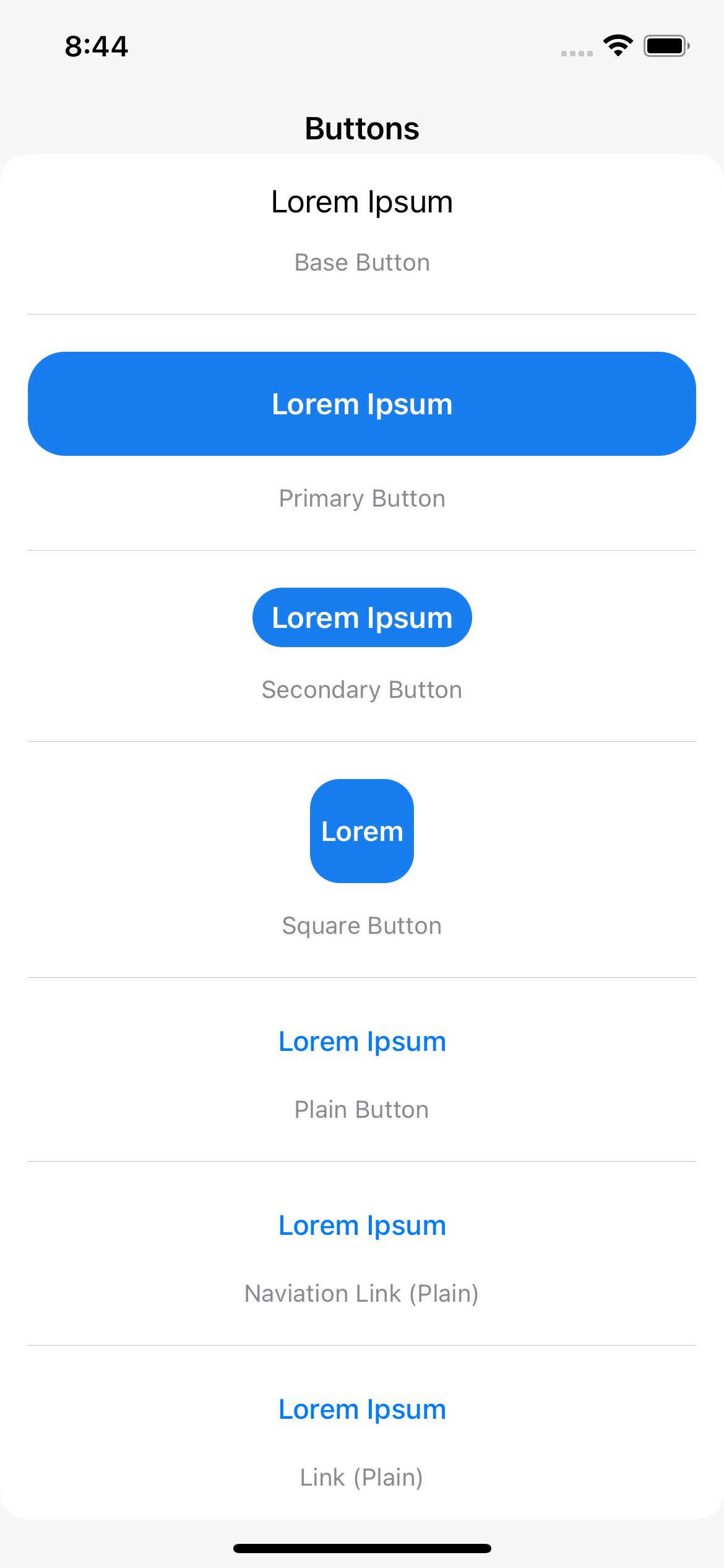
**Buttons.** VBaseButton, VPrimaryButton, VSecondaryButton, VSquareButton, VPlainButton, VNavigationLink, VLink
**State Pickers.** VToggle, VCheckBox, VRadioButton
**Item Pickers.** VSegmentedPicker, VMenuPicker, VWheelPicker
**Value Pickers.** VStepper, VSlider, VRangeSlider
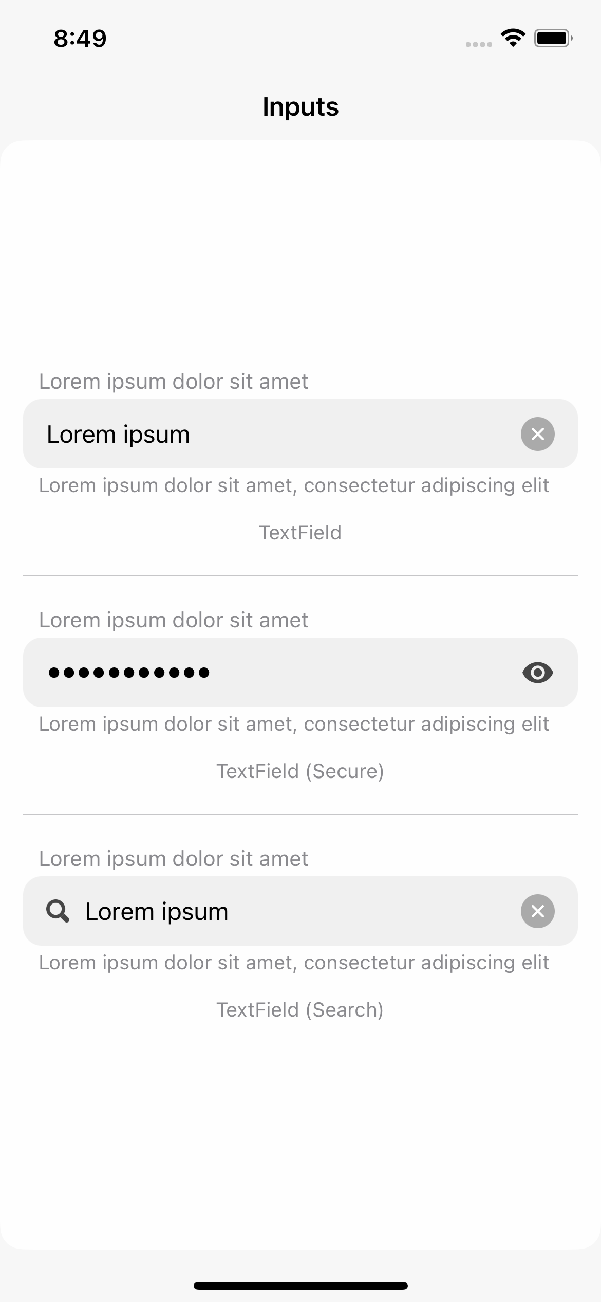
**Inputs.** VTextField
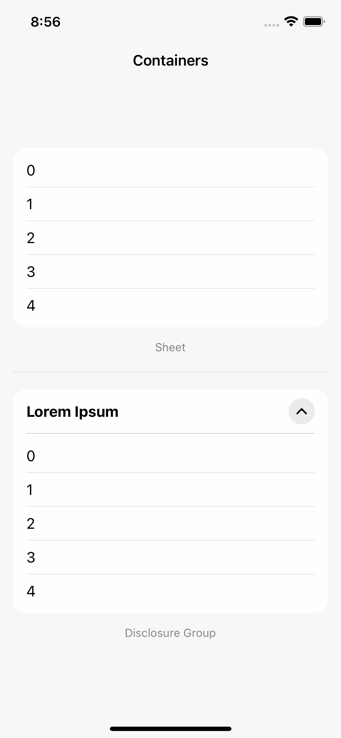
**Containers**. VSheet, VDisclosureGroup
**Lists.** VLazyScrollView, VList
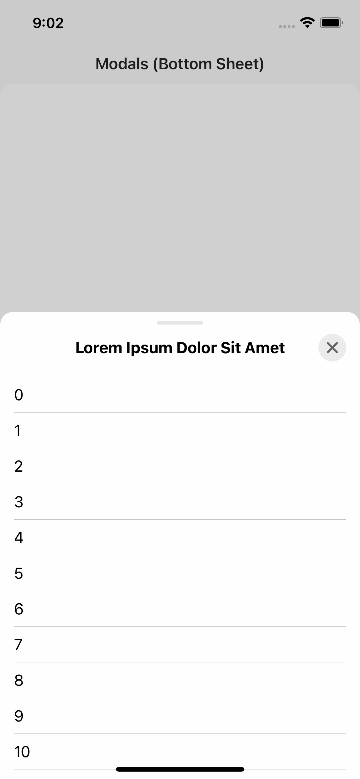
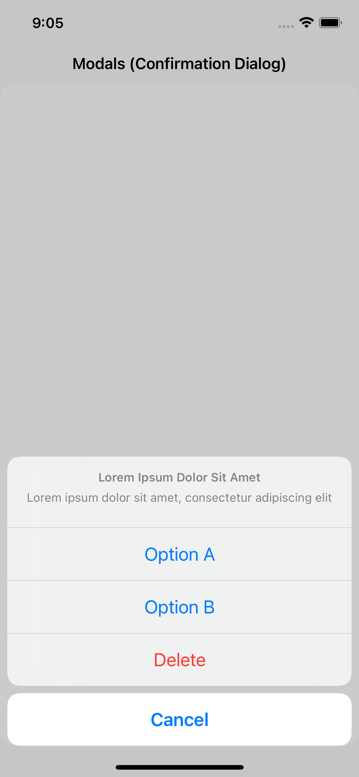
**Modals.** VModal, VBottomSheet, VSideBar, VAlert, VConfirmationDialog, VMenu
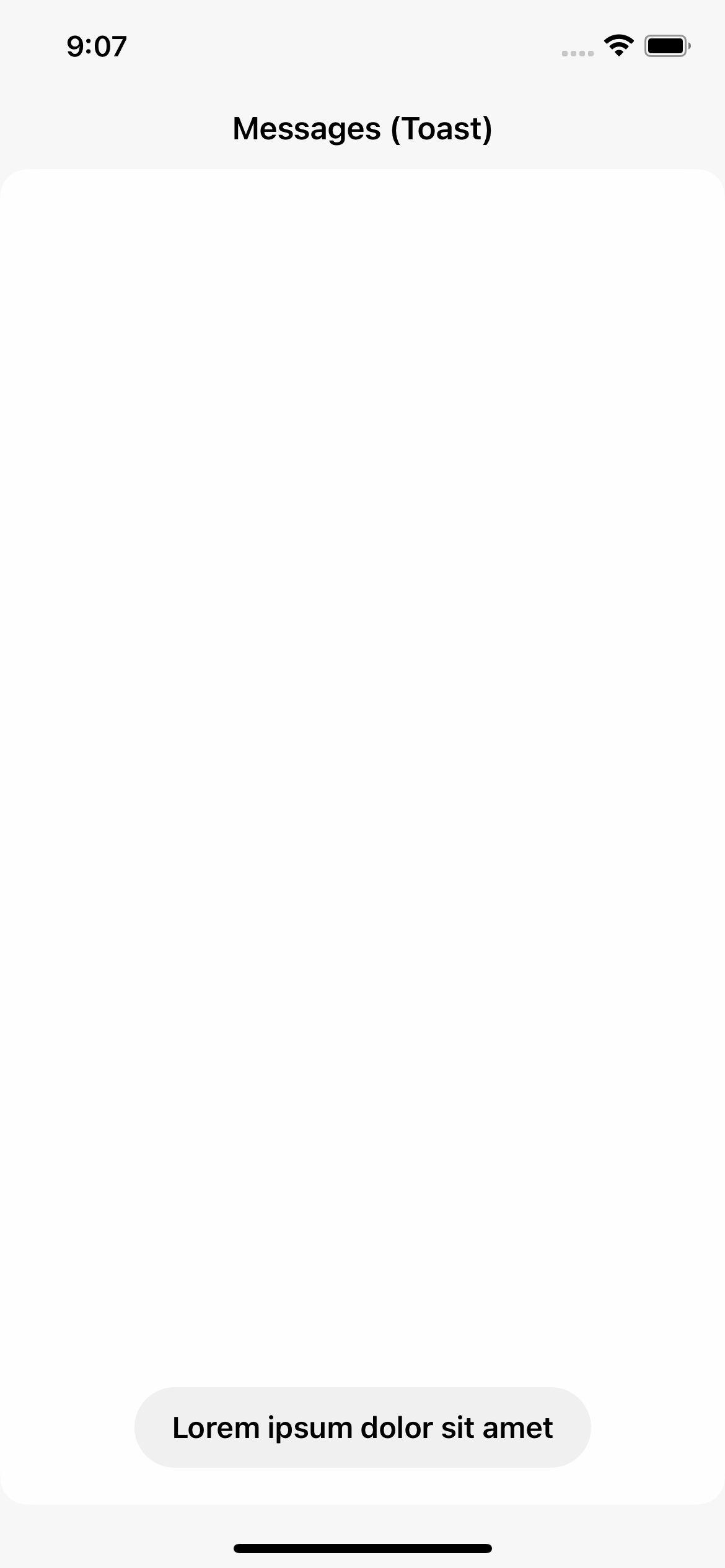
**Messages.** VToast
**Indicators.** VSpinner, VProgressBar, VPageIndicator
**Misc.** VText
## Brand Book










## Guidelines
#### Models
Components are not meant to be customized like you would a native SwiftUI component.
Instead, model can be passed as parameter to initializers. This parameter has default value, and is not required every time you create a view.
Models are structs with default values. They break down into 5 sub-structs: `Layout`, `Colors`, `Fonts`, `Animations`, and `Misc`.
For instance, changing foreground color of `VSecondaryButton` can be done by passing a model.
Not Preferred:
```swift
var body: some View {
VSecondaryButton(
action: doSomething,
title: "Lorem ipsum"
)
.foregroundColor(.black)
}
```
Preferred:
```swift
let model: VSecondaryButtonModel = {
var model: VSecondaryButtonModel = .init()
model.colors.textContent = .init(
enabled: .black,
pressed: .gray,
disabled: .gray
)
return model
}()
var body: some View {
VSecondaryButton(
model: model,
action: doSomething,
title: "Lorem ipsum"
)
}
```
Alternately, you can create static instances of models for reusability.
```swift
extension VSecondaryButtonModel {
static let someModel: VSecondaryButtonModel = {
var model: VSecondaryButtonModel = .init()
model.colors.textContent = .init(
enabled: .black,
pressed: .gray,
disabled: .gray
)
return model
}()
}
var body: some View {
VSecondaryButton(
model: .someModel,
action: doSomething,
title: "Lorem ipsum"
)
}
```
#### Types
Some components take type as parameter. Types are represented as enums, as more can be added in the future.
For instance, `VPageIndicator` has three types: `Finite`, `Infinite`, and `Auto`. Unlike models, types may be required in some instances. For other enums, a default case is provided.
```swift
var body: some View {
VStack(content: {
VPageIndicator(type: .finite, total: 9, selectedIndex: 4)
VPageIndicator(type: .infinite(), total: 99, selectedIndex: 4)
VPageIndicator(type: .auto(), total: 99, selectedIndex: 4)
})
}
```
Some enums can also contain additional cases, such as `focused` for `VBaseTextField` and `VTextField`.
#### Animations
VComponents approaches animations as bound to components and their models, and not to state. Which means, that to modify a state of component with an animation, you need to pass a custom model.
Not Preferred:
```swift
@State var isOn: Bool = false
var body: some View {
VStack(content: {
VToggle(isOn: $isOn, title: "Lorem ipsum")
VSecondaryButton(
action: { withAnimation(nil, { isOn.toggle() }) },
title: "Toggle"
)
})
}
```
Preferred:
```swift
@State var isOn: Bool = false
let model: VToggleModel = {
var model: VToggleModel = .init()
model.animations.stateChange = nil
return model
}()
var body: some View {
VStack(content: {
VToggle(model: model, isOn: $isOn, title: "Lorem ipsum")
VSecondaryButton(
action: { isOn.toggle() },
title: "Toggle"
)
})
}
```
First method is not only not preferred, but it will also not work. Despite specifying `nil` to change state, `VToggle` would still use its default animation.
Components manage state parameters internally, and animations used to change them externally do not have any effect.
Thought process behind his design choice was to centralize animations to model.
Components also prevent themselves from modifying external state with an animation.
## Demo
Project contains demo app, that can be run to showcase all components.
 ## Installation
#### Swift Package Manager
Add `https://github.com/VakhoKontridze/VComponents` as a Swift Package in Xcode and follow the instructions.
## Versioning
***Major***. Major changes, such as big overhauls
***Minor***. Minor changes, such as new component, types, or properties in models
***Patch***. Bug fixes and improvements
## Contact
e-mail: vakho.kontridze@gmail.com
## Installation
#### Swift Package Manager
Add `https://github.com/VakhoKontridze/VComponents` as a Swift Package in Xcode and follow the instructions.
## Versioning
***Major***. Major changes, such as big overhauls
***Minor***. Minor changes, such as new component, types, or properties in models
***Patch***. Bug fixes and improvements
## Contact
e-mail: vakho.kontridze@gmail.com